Coffee Corner ☕️
In this project case study, I will be sharing my experience designing a mobile app to help users discover and navigate coffee shops based on their needs and preferences in Berlin. Throughout the design process, I concentrated on crafting an intuitive user interface that would enhance the overall user experience.
Understanding Users Preferences
The design process began with comprehensive user research to understand the coffee culture and existing solutions. This phase was critical to ensure that the Coffee Corner App addressed real user needs and stood out in a competitive market. This involved conducting surveys and interviews with over 60 coffee enthusiasts. For me, surveys were essential to gather firsthand information about users' preferences, habits, and pain points.
Competitive Analysis:
Analyzed popular apps like Yelp and Foursquare to identify strengths and weaknesses. This analysis helped in understanding what worked well in other apps and what could be done better in Coffee Corner.
Ideation & Conceptualization
Based on the research, I created three primary user personas. These personas represented different segments of the target audience and helped guide design decisions throughout the project.
The Coffee Connoisseur ☕️: Loves discovering new and unique coffee places.
The Busy Professional 👩🏼💻: Needs quick and reliable recommendations for meetings.
The Social Butterfly🦋: Looks for trendy spots to hang out with friends.
Creating user personas was crucial for understanding the diverse needs and behaviors of potential users. This helped in prioritizing features effectively.
Designing the Experience
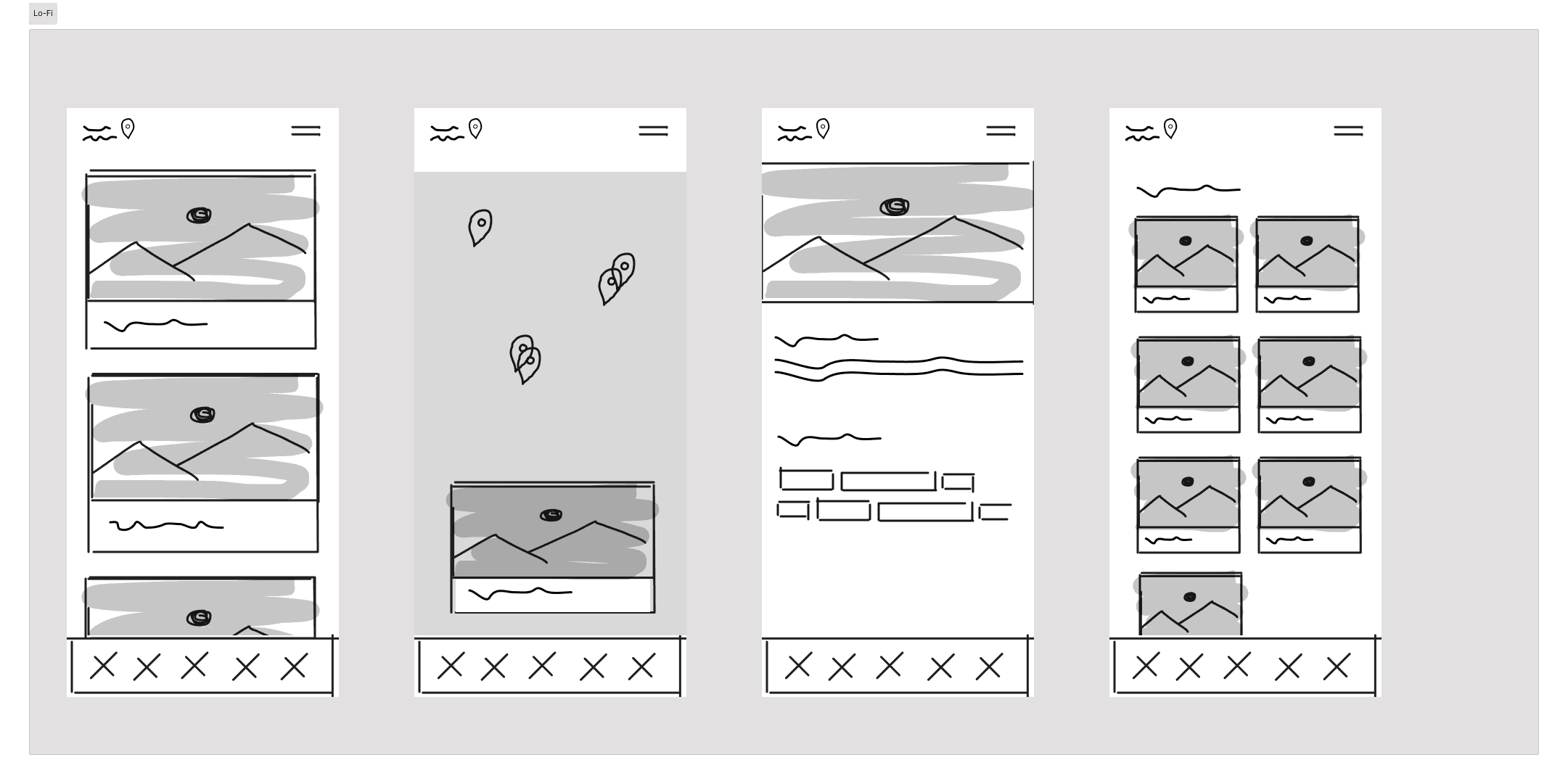
Starting with low-fidelity wireframes, I sketched out the basic layout and navigation flow. The focus was on simplicity and ease of use, ensuring that users could easily navigate the app and find what they were looking for.
This step was to visualize the structure and functionality of the app before diving into detailed design. It saved me time in the later stages.
Key Screens:
🏠 Home: Personalized recommendations and popular spots.
🔍 Search: Advanced filters for location, rating, and amenities.
🗺 Map View: Interactive map to explore nearby cafes which are laptop-friendly and have good coffee beans.
👥 Profile: User reviews, favorites, and history.
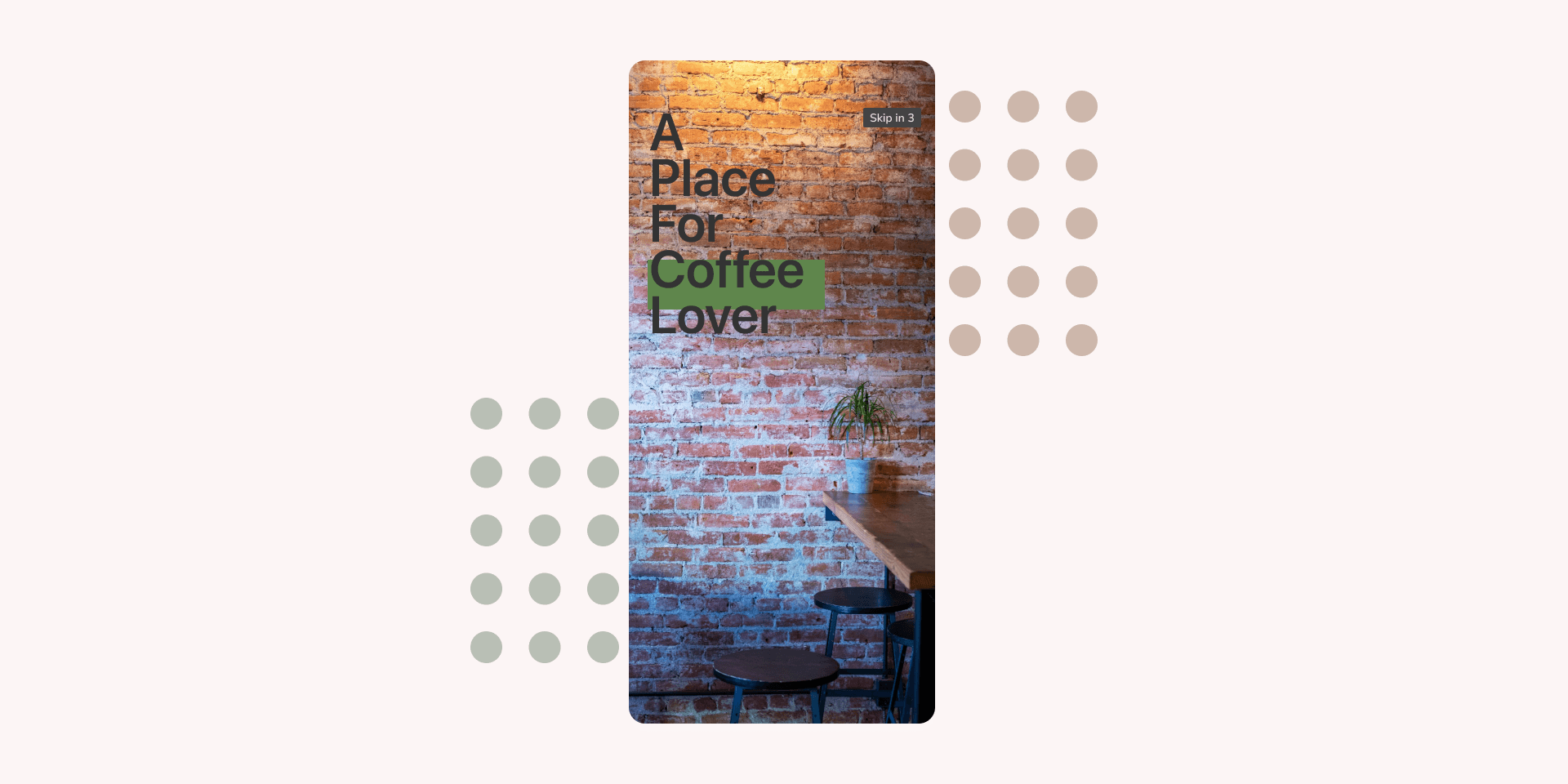
Visual Design
With a clear direction, I moved on to creating high-fidelity mockups in Figma. The design aesthetic aimed to capture the warmth and coziness of a coffee place, with a modern and clean interface.
Color Palette:
Warm Browns: Evoking the rich aroma of coffee.
Soft Neutrals: Enhancing readability and focus.
Typography:
Font: Elegant and readable SF Pro.
Focusing on a warm and inviting visual design was essential to create an emotional connection with users, making the app feel like a cozy and familiar place.
Interactive Prototypes
Using Figma’s prototyping features, I tried to create interactive prototypes to demonstrate user flows and interactions. Interactive prototypes allowed for realistic simulation of the app, making it easier to communicate the design vision and functionality to stakeholders and users and gather further feedback.
Conclusion & Reflections
The journey of creating Coffee Corner has been both challenging and rewarding. From the initial research to the final design. The result is an app that is about connecting coffee enthusiasts with the perfect cup, the perfect cafe experience, and laptop-friendly. ☕️
As a coffee enthusiast myself, this project was something that I loved. I aimed to create something that reflects my passion for discovering new coffee places and laptop friendly and sharing those experiences with others.